Kitchens don’t age overnight. It’s a slow creep. One day, the morning light hits your cabinets a little differently, and that warmth you liked years ago suddenly feels… heavy. Not broken. Just off.
Cabinet color usually sits at the center of that shift. It takes up the most space, so when it starts to feel dated, everything else follows. You notice it more after small updates, too, new backsplash, better lighting, maybe new floors. Then the cabinets don’t quite keep up.
Around Orlando, this shows up a lot in early 2000s homes. The layout still works, but visually, something feels stuck.
In 2026, design trends shift toward balance, lighter, warmer, and more natural. Let’s walk through the outdated kitchen cabinet colors that are showing up now and what’s quietly replacing them.
Quick Check: Does Your Kitchen Already Feel Outdated?
You don’t always notice it all at once. It shows up in small ways.
You’ll catch it when the cabinets look a little “muddy” next to your backsplash. Or when photos make the space feel darker than it actually is. Sometimes it’s the way light hits, especially here in Florida, and suddenly the tone feels too yellow, too gray, or just off.
- Cabinets feel darker than the rest of the room.
- Finishes don’t quite match anymore.
- The space feels dull in photos.
- Lighting exaggerates undertones
If even one of these stands out, cabinet color is usually the first place to look.
Why Cabinet Color Dates a Kitchen Faster Than Anything Else
Cabinets take up the most visual real estate. That alone makes them the first thing that shifts from current to dated.
But it’s not just size. It’s how color interacts with everything else. Flooring, countertops, and lighting, especially lighting. In Florida, that high, direct sunlight is unforgiving. It pulls undertones forward. A gray that once felt neutral can suddenly lean icy blue. A warm wood tone can turn orange fast.
That’s why cool grays often start to feel cold here. Not in theory, in real kitchens, at noon, with light bouncing off tile and quartz.
Open layouts make it even more obvious. When the kitchen blends into the living space, the home’s atmosphere depends on whether the cabinet tones feel balanced.
Professional designers see this all the time. The layout still works. Storage is fine. But visually, the kitchen doesn’t match how the rest of the home feels anymore.
And in 2026, some cabinet colors don’t just feel off. They stand out.
Outdated Kitchen Cabinet Colors in 2026 (Do You Have One of These?)
Some colors don’t fade quietly. They start competing with everything else in the room. They pull the light the wrong way. They make the space feel tighter, darker, or just harder to work with. These are the outdated kitchen cabinet colors showing up most often right now.
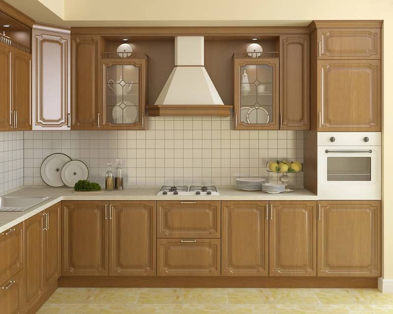
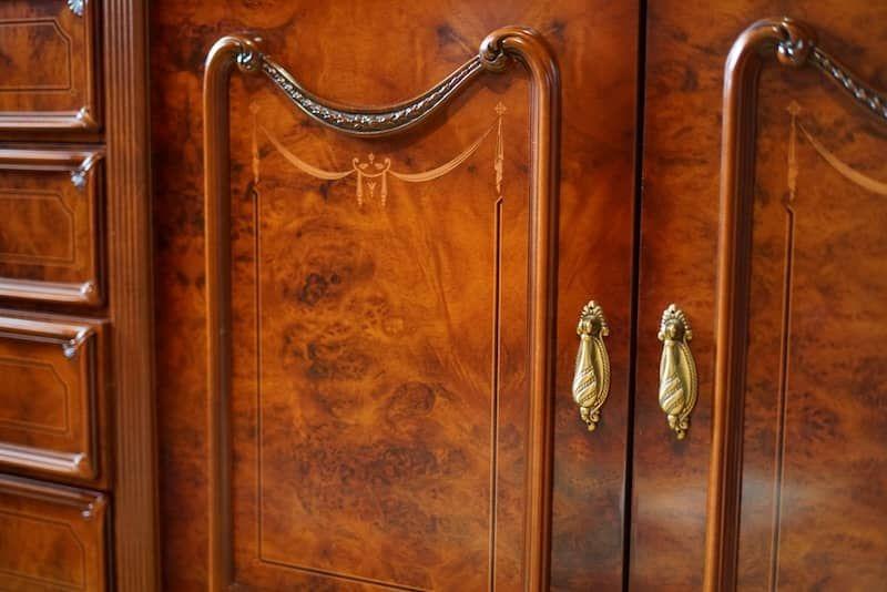
Dark Cherry and Red-Toned Woods0
There was a time when cherry wood and other richly stained woods felt like the upgrade. Deep, glossy, traditional.
Now, in most Orlando kitchens, they just feel heavy. Especially in spaces without strong natural light, these tones absorb brightness instead of reflecting it. You try to balance it with lighter counters, maybe brighter walls, but the cabinets still dominate.
It’s not that they’re “bad.” It’s that they don’t breathe well in today’s layouts.
Yellow-Toned Oak (Golden Oak)
Honey oak cabinets are probably the most recognizable of all outdated cabinet shades. That strong yellow undertone clashes with newer paint colors almost immediately.
You’ll see this a lot in older homes where floors or counters have already been updated. The cabinets end up looking like they belong to a different kitchen entirely.
This is one of the few cases where painting kitchen cabinets can make a surprisingly huge difference, if everything else is still in good shape.
The Gray-Out Fatigue (Cool Grays)
Not long ago, gray was everywhere. Now, there’s a kind of fatigue around it.
Cool grays started blending together. Kitchens lost contrast, lost warmth. What was supposed to feel modern now feels a bit… uninspired.
And again, Florida lighting doesn’t help. It can push gray into blue tones, making the space feel colder than intended. Pair that with cool white cabinets, and the whole room can start to feel cold instead of clean.
Stark White Without Contrast
White isn’t going away, but stark white cabinets or overly bright white cabinets without contrast can feel unfinished.
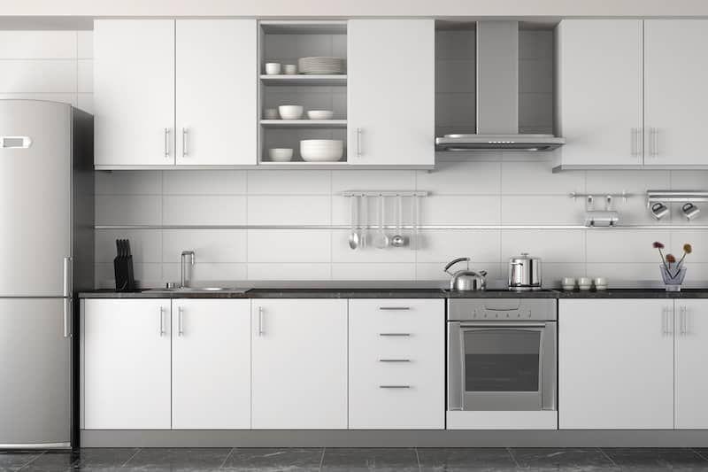
You’ll see kitchens with stark white cabinetry, white backsplash, white counters… and nothing breaking it up. No depth. No texture.
In strong sunlight, this can even feel harsh. The space reflects light instead of softening it.
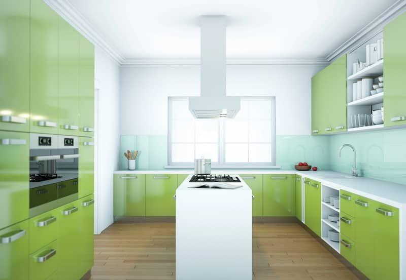
All-Black Cabinets (Too Much Weight)
All black kitchen cabinets or solid black cabinets look bold at first. But over time, they can feel overwhelming, especially in smaller kitchens.
Solid black cabinets lack variation. Without enough natural light or contrast, the space starts to feel boxed in.
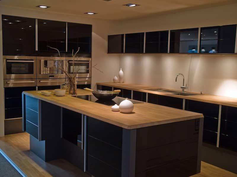
Even stark black finishes are being replaced now with softer neutrals or deeper tones that still give contrast without the weight.
What Kitchen Cabinet Colors Are In for 2026? (And Why They Work)
If those heavier tones are fading out, 2026 is leaning toward something more breathable. Not overly minimal. Not overly dramatic. Just balanced. These kitchen cabinet colors feel easier to live with, and that’s the point.
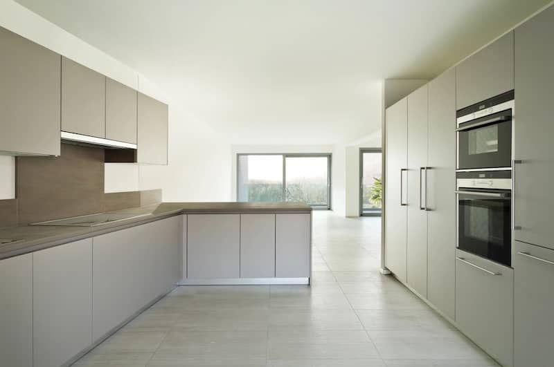
Warm Whites and Soft Creams
This is probably the biggest shift. Instead of harsh whites, homeowners are choosing cream whites and warm beiges.
They still keep the kitchen bright, but they feel inviting. Less sterile. More natural.
A small detail designers are leaning into, pairing these tones with matte finishes and subtle hardware like matte bronze or brushed brass. It softens everything just enough.
Natural Wood Tones (Light to Medium)
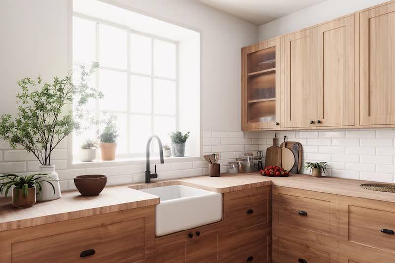
Natural woods are coming back, but in a much lighter, more relaxed way. Think white oak, soft walnut, even mixed finishes.
These tones create warmth without making the space feel closed in. They work especially well in Florida homes where light can wash out darker finishes.
It also ties into a bigger shift toward nature-inspired palettes. Colors that feel pulled from the natural world, not a showroom.
Earthy Greens and Muted Blues
This is where you see more personality coming in. Colors like sage green and other earthy greens are showing up more, especially on islands.
They don’t overpower the space. They ground it.
Interior designers often pair these tones with lighter uppers or natural wood to keep the balance. It adds color without making the kitchen feel overly themed.
Two-Tone Cabinets That Add Depth
More homeowners are mixing finishes instead of committing to one color.
- Light uppers, darker lowers
- Wood island, painted perimeter
- Neutral base with a subtle accent
It adds dimension without clutter. It’s also one of the easiest ways to transition away from outdated kitchen cabinet colors without going all-in on something bold.
Soft Charcoal and Warmer Neutrals
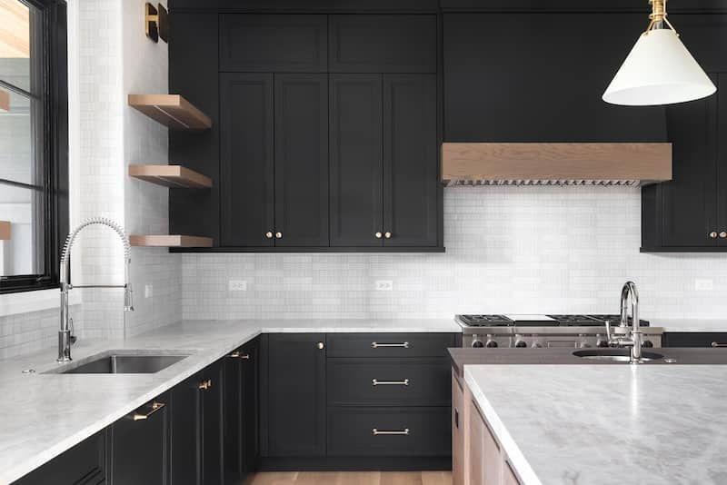
For those who still want contrast, soft charcoal and warmer neutrals are replacing black and gray.
They still anchor the space, but they don’t carry the same weight as solid black cabinets.
Paired with matte black hardware, it feels intentional. Clean, but not cold.
Why 2026 Kitchen Color Trends Are Shifting (Not Just Style)
This shift isn’t random. It’s how people are using their homes now.
Kitchens aren’t just for cooking. They’re where people gather, work, and spend time. That’s why homeowners are increasingly seeking spaces that feel comfortable, not staged.
Designers keep coming back to the same two key themes: warmth and texture.
Buyers are also expecting kitchens to feel updated the moment they walk in. That affects a home’s resale more than most people realize.
So these design trends shift toward colors that feel natural, balanced, and easy to live with, not extremes that fade quickly.
Should You Replace or Refinish Your Cabinets?
Before jumping into changes, it helps to step back and look at what’s actually bothering you.
When a Color Update Is Enough
If the layout still works and the cabinets are solid, painting kitchen cabinets can go a long way.
For example, swapping out honey oak cabinets for softer neutrals can completely change how the kitchen feels without a full renovation.
This works when:
- Storage still fits your needs.
- Structure is in good shape.
- The issue is mostly visual.
When Color Is Just the Symptom
There’s a point where changing cabinet colors doesn’t solve much.
If the kitchen feels tight, the workflow is off, or storage isn’t working, you’re looking at something deeper.
This is where professional designers step in. The color feels wrong because the design itself isn’t keeping up anymore.
If you notice the problem every time you use the kitchen, not just when you look at it, color alone won’t fix it.
The Real Cost of Keeping an Outdated Kitchen
Most homeowners don’t decide to remodel in one moment. It builds.
At first, it’s just visual. The dull paint color feels off. Then it becomes functional. The kitchen doesn’t feel as easy to use.
Guests notice it sooner. Photos make it more obvious. Over time, the space just doesn’t feel worth investing in piece by piece.
There’s also the impact on the home’s resale. Buyers pick up on outdated kitchen cabinet colors almost immediately. It shapes how they see the entire home.
The longer it’s left alone, the harder it becomes to fix with small updates.
That’s usually the point where homeowners stop patching things and start thinking about doing it right.
How to Choose the Right Cabinet Color for Your Home
Start with light. Florida homes get strong, shifting light throughout the day, and that changes how paint colors read.
Then look at what’s staying: floors, counters, backsplash. The right materials should work together, not compete.
A simple approach many interior designers use:
- Choose softer neutrals for main cabinets.
- Add depth with wood or accent tones.
- Avoid extremes that might feel dated quickly.
The goal isn’t just picking what’s on trend. It’s creating a kitchen that still feels right years from now.
When It’s Time to Rethink the Entire Kitchen
Sometimes the issue goes beyond color.
If the layout feels tight, storage doesn’t work, or the space doesn’t match how you use it anymore, it’s not just about finishes. It’s about design.
This is where many homeowners in Orlando start realizing the difference between a quick update and a real upgrade.
Better flow. Smarter storage. More usable space.
At that point, cabinet color becomes part of a bigger solution, not the solution itself.
See What These 2026 Colors Look Like in Real Kitchens
Some kitchens just need a color shift. Others need a better plan behind it. The difference becomes clear once you see how everything comes together in terms of layout, storage, materials, and finish.
At Nu Kitchen Designs, the focus isn’t just on picking cabinet colors. It’s about creating kitchens that actually work in real homes across Orlando.